Hello,
Wow time is flying now, all downhill to Christmas 😲 as my husband who is a postie says and as you can imagine it's not his favourite time of the year delivery wise.
Anyway I digress, I'm here today to share with you all a new layout I have made for themadscrapper.blog in fact it is a Double Page layout which I think is a first for me. I have taken inspiration again from a free sketch, these are excellent when you feel your stuck in a crafty rut as in all layouts seem to look the same or you've just lost your Mojo and lets face it we all suffer with that at some point don't we? Well here it is and I have added 2 photos at the bottom of the individual pages.
Today I am almost finishing off the paper kit Gather at Home, all links at the bottom of this post. I had to do some clever cutting and patchwork which you will see below. I should have used 2 12x12 paper bases and to those add 2 8x12 stitched pieces but as you can see I didn't have them so I cut 4 12x31/2 strips adding 2 to both ends of the large green.
Then the other 2 I added the green strips which were 12 x 1 1/2 to them and added a cream card under all of those for stability. I wasn't worried because I knew my photos would hide all of this. I lay both out on the table side by side to make sure all fitted together perfectly in line phew!
Next I took 3 photos and matted them on to black card 12 x 61/4 leaving no gaps. They were then added on top of the cream side and hey presto you can't tell.
This layout shows photos from a day trip to Seattle whilst on holiday this spring. We first visited the Space Needle and that's where I pressed my quarter (not a penny as I said) I also picked up a few postcards one of which is this scene below. I have tucked under a little laser cut, a fussy cut flower or two from another paper and a couple of coffee cups, all have been added using foam pads.
A close up of the tight joins and the pressed quarter which I had to use Glossy Accents to adhere it to the page with. We did laugh at the fact it cost me a $ to get a quarter back!
Top of the needle, also you can see how you cant tell what's going on underneath the photos. The butterfly is a laser cut.
Here is another post card which I liked added under the main photo to this page. The sketch shows a large heart but as it's just for guidance I decided not to add it.
This next photo shows the title which is a puffy sticker by Simple Stories (which I won recently) you may have some in your stash I thought it fit the layout perfectly. A few more coffee cups and another laser cut.
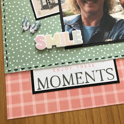
Here you can see another puffy sticker, a butterfly laser cut and the text at the bottom is cut from one of the 4x4 journal cards in the kit. As you will have noticed I have matted everything on to black card for a pop of drama and this time I have typed my journaling to keep with the sketch plan.
This is a close up of the left hand page.
and this a close up of the right.
Thanks for stopping by again today. I do hope I have inspired you to try a double page layout, I had a lot of fun. It allows you to showcase more photos from your event, mine on this side were 4x6 but there's nothing stopping you from adding 6 4x4 you just need to alter the bottom piece after the green.
If you're looking for more papers and embelishments and you can pop in to see Janine great or go online to www.themadscrapper.co.uk and shop from the comfort of your armchair like I do.
Thanks again
Sue
Please find a full list of shop supplies:
Here is a look at the sketch I used today.


